
DTF Printing Color Accuracy: Achieving Perfect Brand Matches
If you’ve ever received a custom printed item that looked nothing like what you expected, you know the frustration of poor color accuracy. In the world of Direct-to-Film (DTF) printing, achieving precise color reproduction isn’t just important—it’s absolutely critical for maintaining brand integrity and customer satisfaction. Whether you’re a print shop owner, a business looking to create branded merchandise, or simply someone curious about the technical side of modern printing, understanding DTF color accuracy can save you time, money, and countless headaches.
The challenge of color matching in DTF printing goes beyond simply hitting the “print” button and hoping for the best. It’s a complex dance between technology, materials, and technique that requires both understanding and finesse. When done correctly, DTF printing can produce vibrant, durable prints that perfectly match your brand colors. When done poorly, well, let’s just say your royal blue logo might end up looking more like a sad purple mess.
Understanding DTF Printing and Color Challenges
Direct-to-Film printing has revolutionized the custom apparel industry by offering incredible versatility and quality. Unlike traditional screen printing or vinyl cutting, DTF allows for full-color designs with intricate details and gradients. However, this flexibility comes with its own set of color accuracy challenges that can make or break your final product.
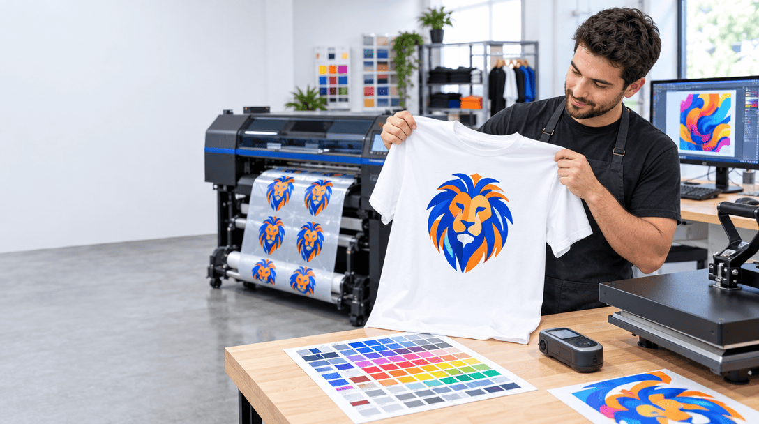
The DTF process involves printing your design onto a special film using water-based inks, applying adhesive powder, curing the print, and then heat pressing it onto your chosen garment. Each step in this process can affect color accuracy, from the initial digital file to the final pressed product. The key is understanding where color shifts can occur and how to compensate for them.
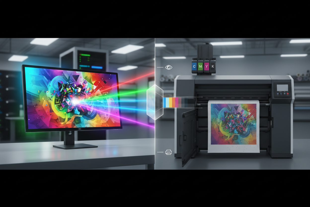
One of the biggest hurdles in DTF color accuracy is the difference between what you see on your computer screen and what comes out of the printer. Your monitor displays colors using RGB (Red, Green, Blue) light, while your printer uses CMYK (Cyan, Magenta, Yellow, Key/Black) inks. This fundamental difference means that some colors you see on screen simply cannot be reproduced exactly in print—a phenomenon known as being “out of gamut.”
The Science Behind Color Matching in DTF
Color matching in DTF printing isn’t magic—it’s science. Understanding the technical aspects can help you achieve more consistent results and troubleshoot problems when they arise. The foundation of accurate color reproduction lies in color management systems and proper calibration of your equipment.
Every device in your workflow interprets colors differently. Your camera captures colors one way, your monitor displays them another way, and your printer reproduces them in yet another way. Without proper color management, it’s like playing a game of telephone where the message gets more distorted with each step.
The solution lies in using standardized color spaces and ICC (International Color Consortium) profiles. These profiles act as translators between devices, ensuring that a specific color value maintains its intended appearance throughout your workflow. For DTF printing, you’ll typically work with sRGB for your digital files and a custom printer profile that’s been calibrated for your specific printer, inks, and film combination.
Temperature and humidity also play crucial roles in color accuracy. The curing process in DTF printing is sensitive to environmental conditions, and variations can cause color shifts. Maintaining consistent environmental conditions in your workspace isn’t just good practice—it’s essential for reproducible results.
Essential Tools and Equipment for Color Accuracy
Achieving perfect color matches requires the right tools, and while you don’t need to break the bank, investing in quality equipment will pay dividends in consistency and customer satisfaction. The foundation of any color-accurate workflow starts with a properly calibrated monitor.
A colorimeter or spectrophotometer is your best friend when it comes to monitor calibration. These devices measure the actual colors your monitor displays and create a custom profile that ensures what you see is as accurate as possible. Popular options include the X-Rite ColorMunki or the Datacolor SpyderX, both of which offer professional-grade accuracy at reasonable price points.
Your printer is obviously crucial, but it’s not just about having an expensive machine. Regular maintenance, using genuine inks, and keeping your print heads clean are fundamental to consistent color output. Many DTF printers come with built-in color management tools, but understanding how to use them effectively is what separates amateur results from professional quality.
Don’t overlook the importance of consistent lighting in your workspace. Color temperature and intensity affect how you perceive colors, so investing in proper lighting—ideally D50 or D65 standard illuminants—ensures you’re making color judgments under consistent conditions.
Step-by-Step Color Calibration Process
Calibrating your DTF printing system for accurate colors might seem daunting, but breaking it down into manageable steps makes the process much more approachable. The key is to be methodical and document everything so you can replicate successful results.
Start with your monitor calibration. Using your colorimeter, set your monitor to a standard white point (usually D65), a gamma of 2.2, and a brightness level appropriate for your working environment—typically around 120 cd/m². This creates a baseline that ensures you’re seeing colors as accurately as possible on screen.
Next, create or obtain a proper ICC profile for your printer. This involves printing a test chart with hundreds of color patches, measuring them with a spectrophotometer, and generating a profile that maps how your printer actually reproduces colors compared to the intended values. While you can purchase generic profiles, creating a custom profile for your specific printer, ink, and film combination will always yield better results.
The linearization process is equally important but often overlooked. This involves printing gradient patches and adjusting your printer’s output to ensure smooth color transitions without banding or sudden shifts. Many RIP (Raster Image Processor) software packages include linearization tools that automate much of this process.
Finally, establish your standard operating procedures. Document your environmental conditions, material settings, and press parameters. Consistency is the enemy of color variation, so having repeatable processes ensures that today’s perfect print can be replicated next week or next month.
Common Color Matching Mistakes and Solutions
Even with the best intentions and equipment, color matching mistakes happen. The good news is that most common problems have straightforward solutions once you understand what’s causing them.
One of the most frequent issues is metamamerism—when colors appear to match under one lighting condition but look different under another. This typically occurs when you’re trying to match colors that were created using different colorant systems. The solution is to always evaluate color matches under your target lighting conditions, not just your workspace lighting.
Another common mistake is ignoring the substrate’s influence on final color appearance. The same DTF transfer will look different on a white cotton t-shirt versus a black polyester hoodie. Always test your colors on the actual garments you’ll be using, not just sample swatches. The fabric color, texture, and material composition all affect how the final print appears.
Rushing the curing process is a mistake that can significantly impact color accuracy. Under-cured prints may appear dull or shift color over time, while over-cured prints can become brittle and change color immediately. Follow your film and ink manufacturer’s recommendations for time and temperature, and invest in a reliable heat press with accurate temperature control.
Many people also underestimate the importance of ink age and storage conditions. DTF inks have shelf lives and can change properties if stored improperly. Always use fresh inks and store them according to manufacturer specifications to maintain consistent color performance.
Brand Color Standards and Pantone Matching
When working with established brands, you’re often dealing with specific color standards that must be matched precisely. Pantone colors are the gold standard in brand color specification, but translating these spot colors into DTF-printable CMYK values requires careful attention and often some creative problem-solving.
Not all Pantone colors can be accurately reproduced using CMYK inks. Bright oranges, vibrant greens, and fluorescent colors are particularly challenging because they fall outside the CMYK color gamut. In these cases, you’ll need to work with your client to find acceptable alternatives or consider using specialty inks if your equipment supports them.
When a client provides Pantone color specifications, always show them a printed proof before proceeding with production. What looks acceptable as a digital mockup might be unacceptable when printed on the actual garment. This proofing step protects both you and your client from disappointment and costly reprints.
Documentation is crucial when working with brand colors. Keep detailed records of the CMYK values, printer settings, and environmental conditions used for each successful color match. This information becomes invaluable for future orders and helps maintain consistency across different production runs.
Quality Control and Testing Procedures
Establishing robust quality control procedures is what separates professional DTF operations from hobbyist setups. Your quality control process should catch color issues before they reach the customer, not after complaints start rolling in.
Develop a standardized testing protocol that includes printing color reference charts at the beginning of each production day. These charts should include your most commonly used colors as well as challenging colors that tend to shift. Any deviation from your established standards indicates a need for recalibration or maintenance.
Implement batch testing procedures for large orders. Rather than printing hundreds of items and discovering a color issue at the end, print a small test batch first. This approach saves materials and time while ensuring consistency across your entire order.
Keep detailed production logs that include environmental conditions, material lot numbers, and any adjustments made during production. This documentation helps identify patterns in color variation and can be invaluable for troubleshooting recurring issues.
Don’t forget about post-production testing. Colors can continue to develop or shift slightly after the initial pressing, especially with certain ink and film combinations. Establishing wash and wear testing protocols ensures that your color accuracy maintains over the product’s lifetime.
Frequently Asked Questions
Q: How often should I calibrate my DTF printer for color accuracy?
A: You should perform basic calibration checks daily using test prints, and complete recalibration monthly or whenever you notice color shifts. Environmental changes, ink age, and normal wear can all affect color accuracy over time.
Q: Can I achieve perfect Pantone color matches with DTF printing?
A: While DTF printing can achieve very close matches to many Pantone colors, perfect matches aren’t always possible due to gamut limitations. Colors outside the CMYK gamut will require compromise or alternative approaches.
Q: Why do my colors look different on dark versus light garments?
A: The base garment color affects the final appearance because DTF inks are semi-transparent. Dark garments require white underbase printing to achieve accurate colors, while light garments allow the fabric to influence the final color appearance.
Q: What’s the most important factor for consistent DTF color accuracy?
A: Consistency in your entire workflow is crucial—from file preparation and environmental conditions to press settings and curing parameters. Document your successful processes and follow them religiously.
Q: How do I handle customer complaints about color accuracy?
A: Always provide printed proofs before production and maintain detailed documentation of your color matching process. Clear communication about color limitations and approval procedures prevents most disputes.
Q: Should I invest in expensive color measurement equipment?
A: Professional color measurement tools pay for themselves through reduced waste, improved customer satisfaction, and the ability to command premium pricing for accurate color matching services.
Achieving perfect brand matches in DTF printing isn’t just about having the right equipment—it’s about understanding the entire color reproduction process and implementing consistent procedures. While the technical aspects can seem overwhelming at first, the investment in proper color management pays dividends in customer satisfaction, reduced waste, and professional reputation. Remember, color accuracy is a journey, not a destination. Continuous learning, regular calibration, and attention to detail will keep you ahead of the competition and ensure your DTF prints consistently meet or exceed expectations.
Call 972-737-9724 to get a quote
